Riviera Maison’s website needed to match the elegance of its products. The redesign brings clarity, warmth, and refinement to an experience previously hindered by clutter and inconsistent UI.
Objectives
· Modernize the UI while preserving brand heritage.
· Improve product discovery and navigation.
· Enhance visual storytelling and lifestyle inspiration.
· Support ecommerce goals with a clearer, shoppable layout.
Tools Used
Figma · Photoshop · Illustrator
#UI/UX Design #Visual Hierarchy #E-commerce #Responsive Layout
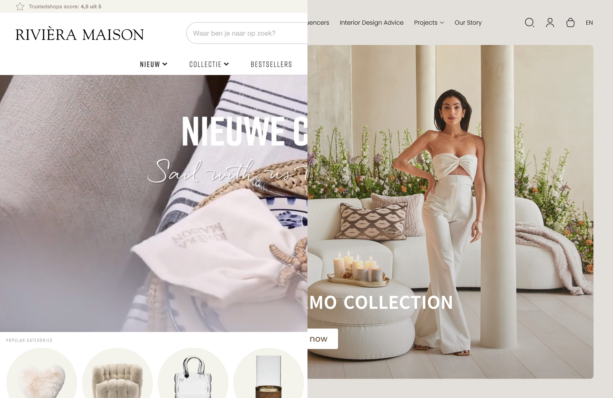
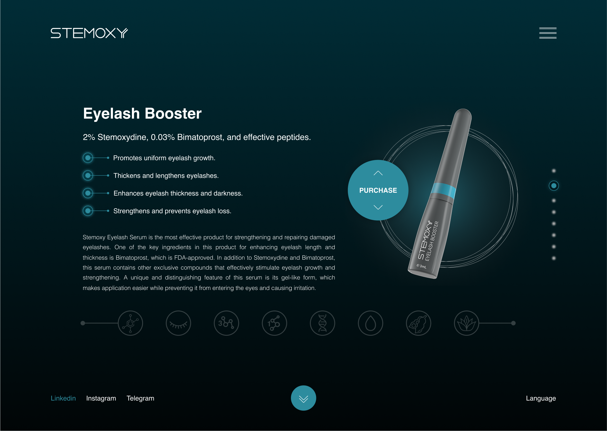
Redefining the First Impression
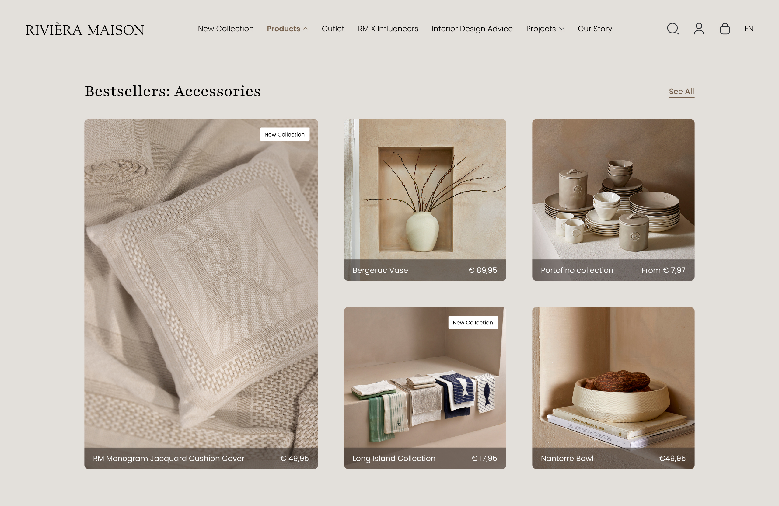
Homepage:
The redesigned homepage brings clarity, balance, and inspiration. With refined typography, generous whitespace, and editorial-style sections, it guides users from featured collections to seasonal trends while preserving the brand’s warm, premium tone.
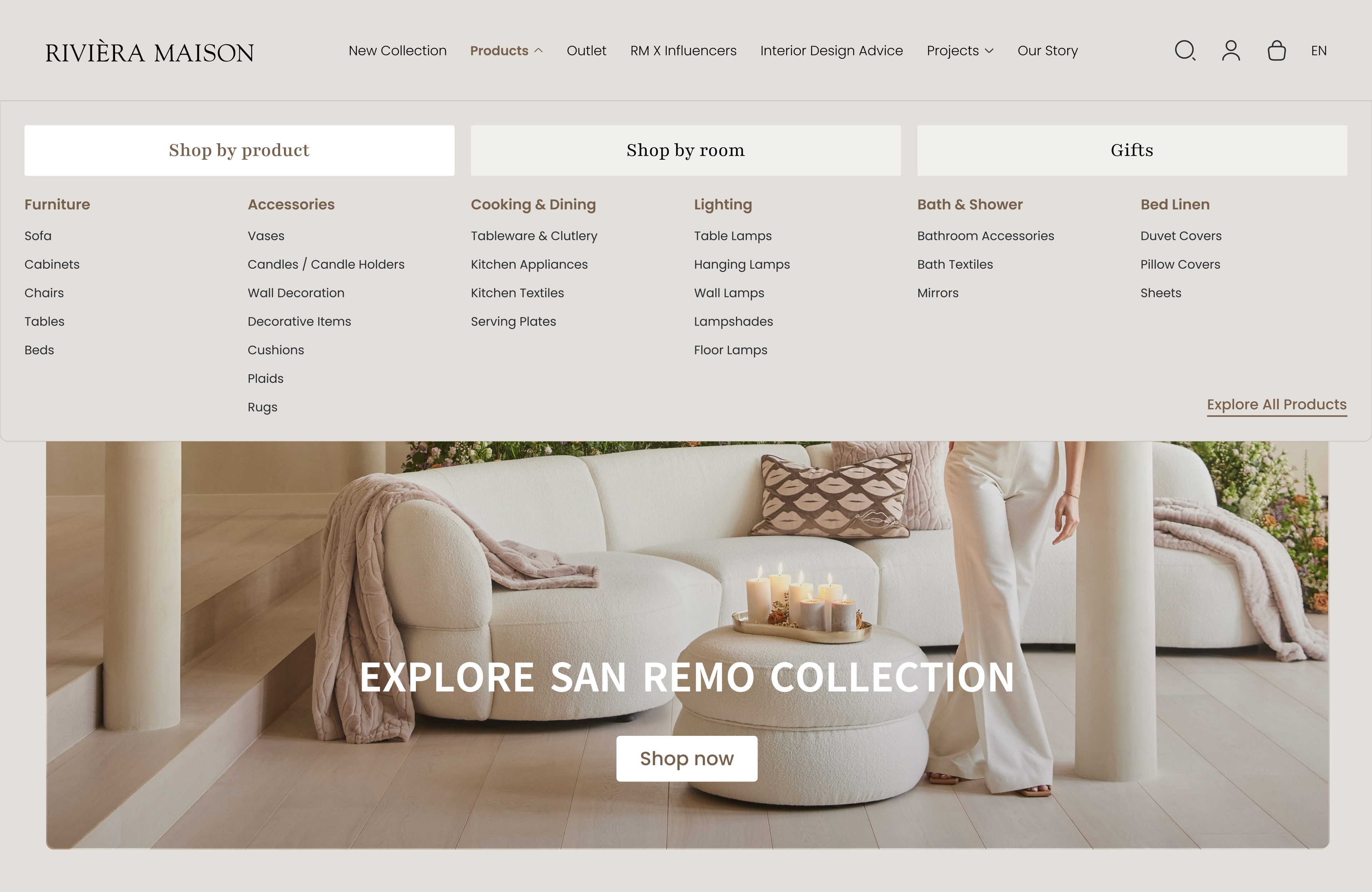
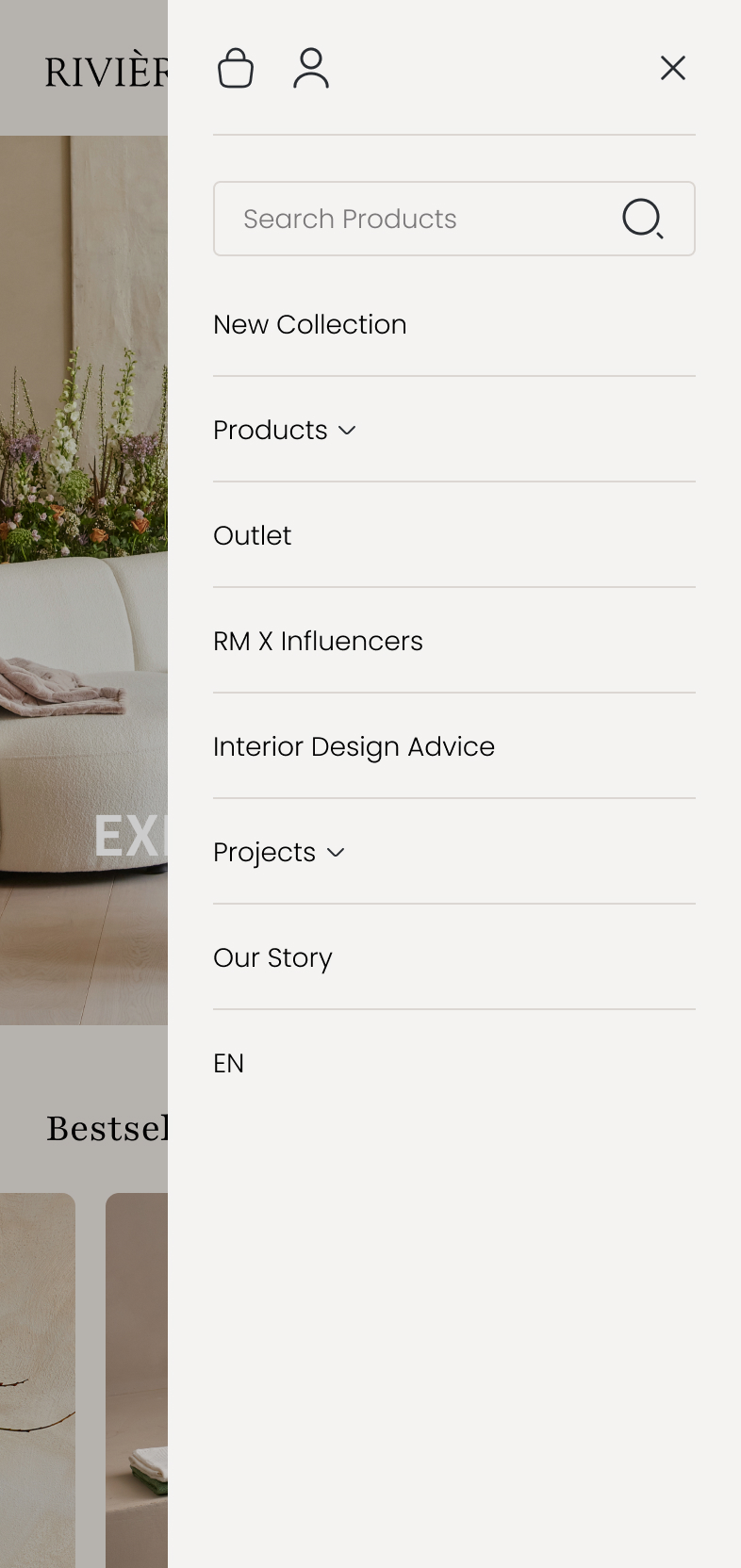
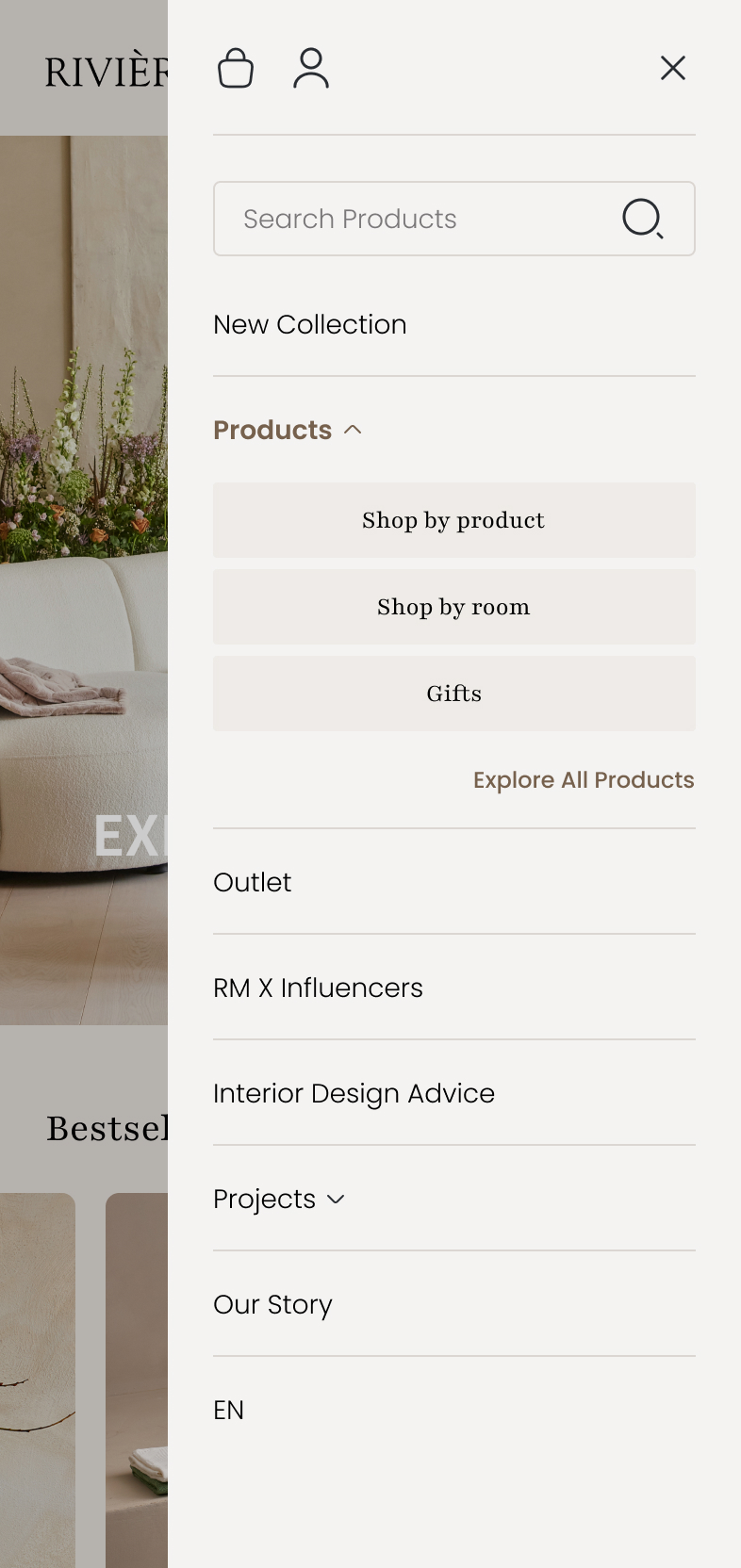
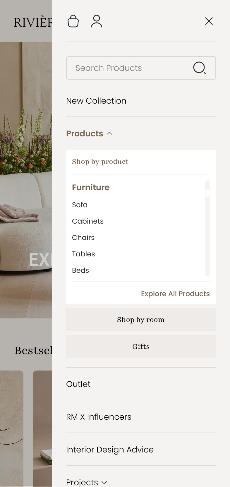
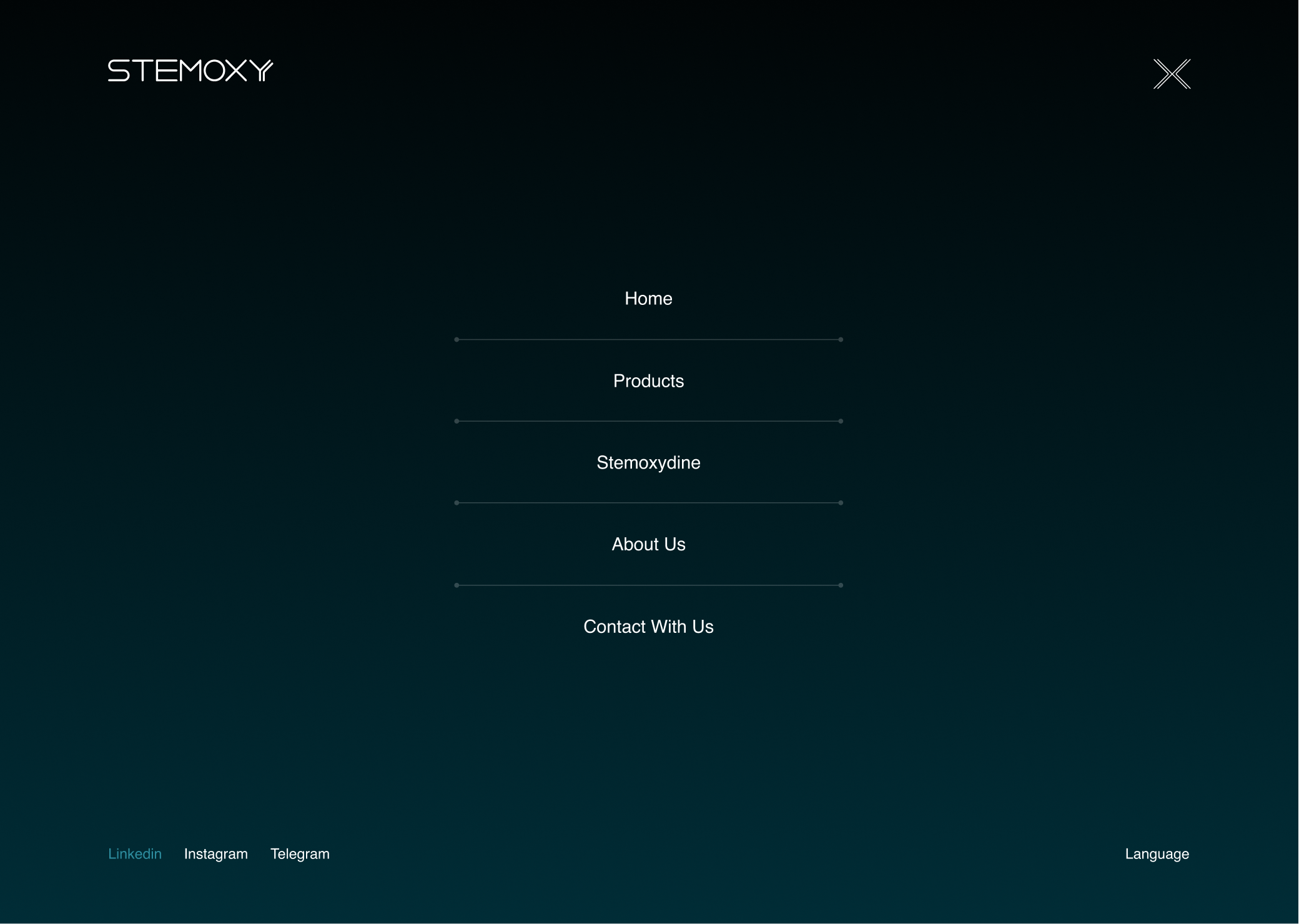
Mega Menu:
The new mega menu simplifies product exploration. Clear hierarchy, grouped categories, and consistent alignment make navigation frictionless, especially on larger product catalogues.
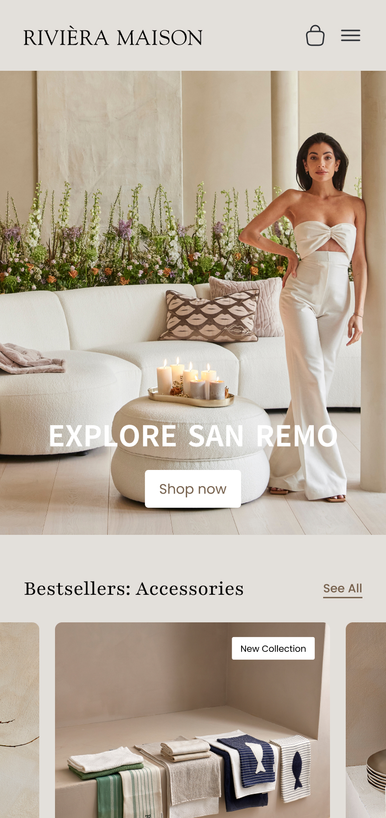
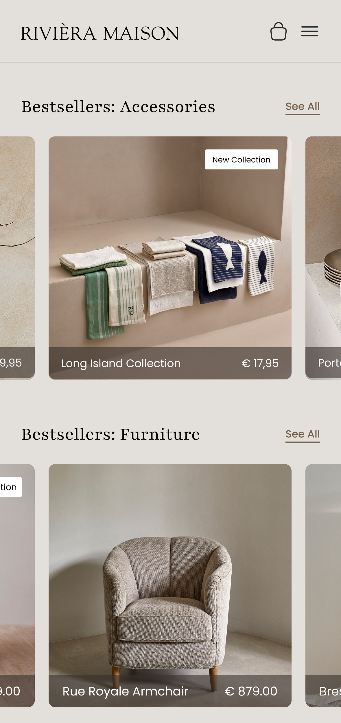
Responsiveness
On mobile, the homepage adapts seamlessly with stacked layouts, intuitive tap targets, and simplified sections, ensuring elegance and usability on smaller screens.
Reflection
This section challenged me to bring structure and refinement to a visually overloaded layout. I learned how powerful spacing, alignment, and restrained color use can be in creating a premium feel. The mega menu redesign also helped me practice balancing aesthetics with information density, something I’d like to push further with hover states and subtle motion next time.
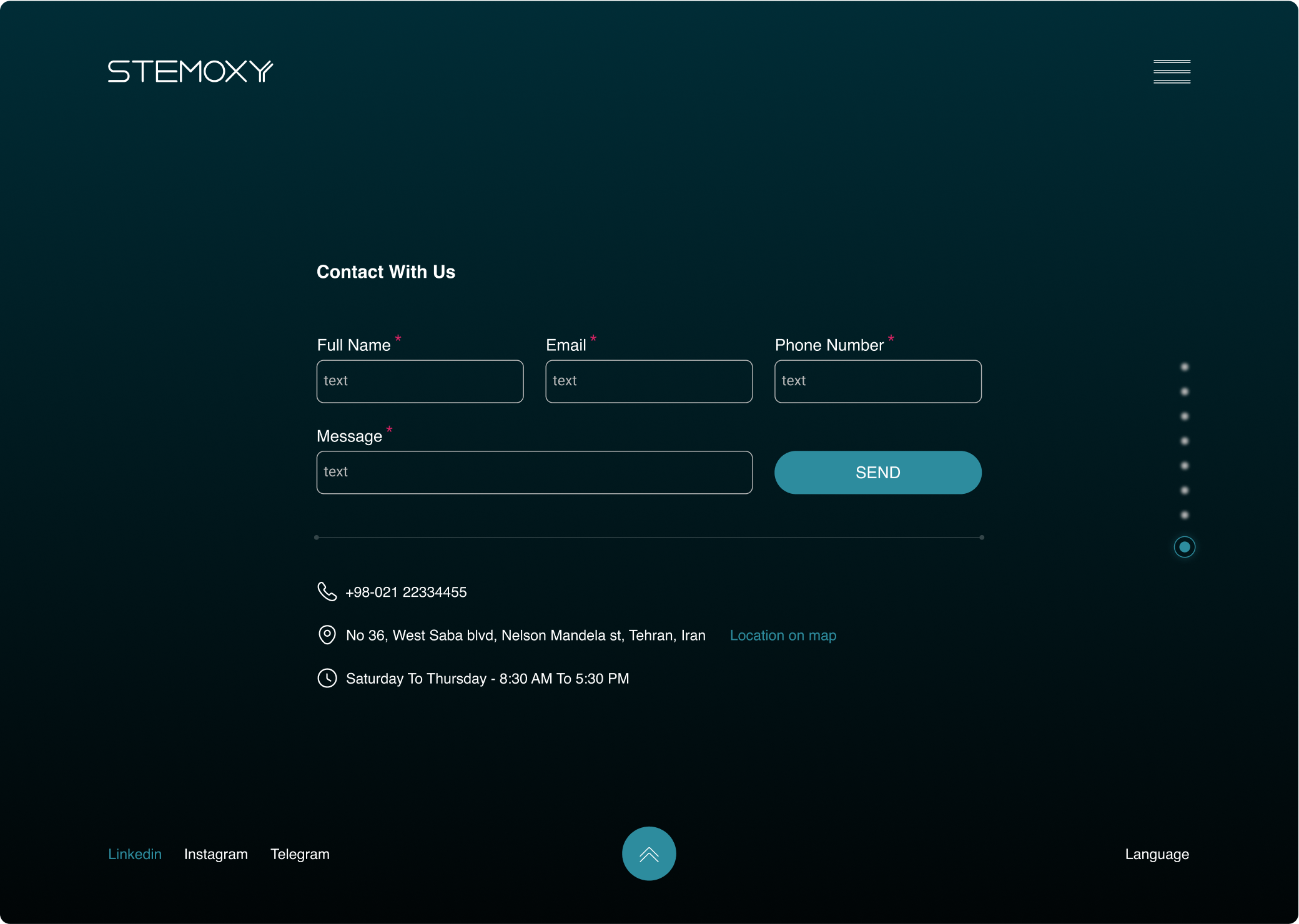
From Browsing to Buying; Simplified
A shoppable experience built for clarity, conversion, and confidence.
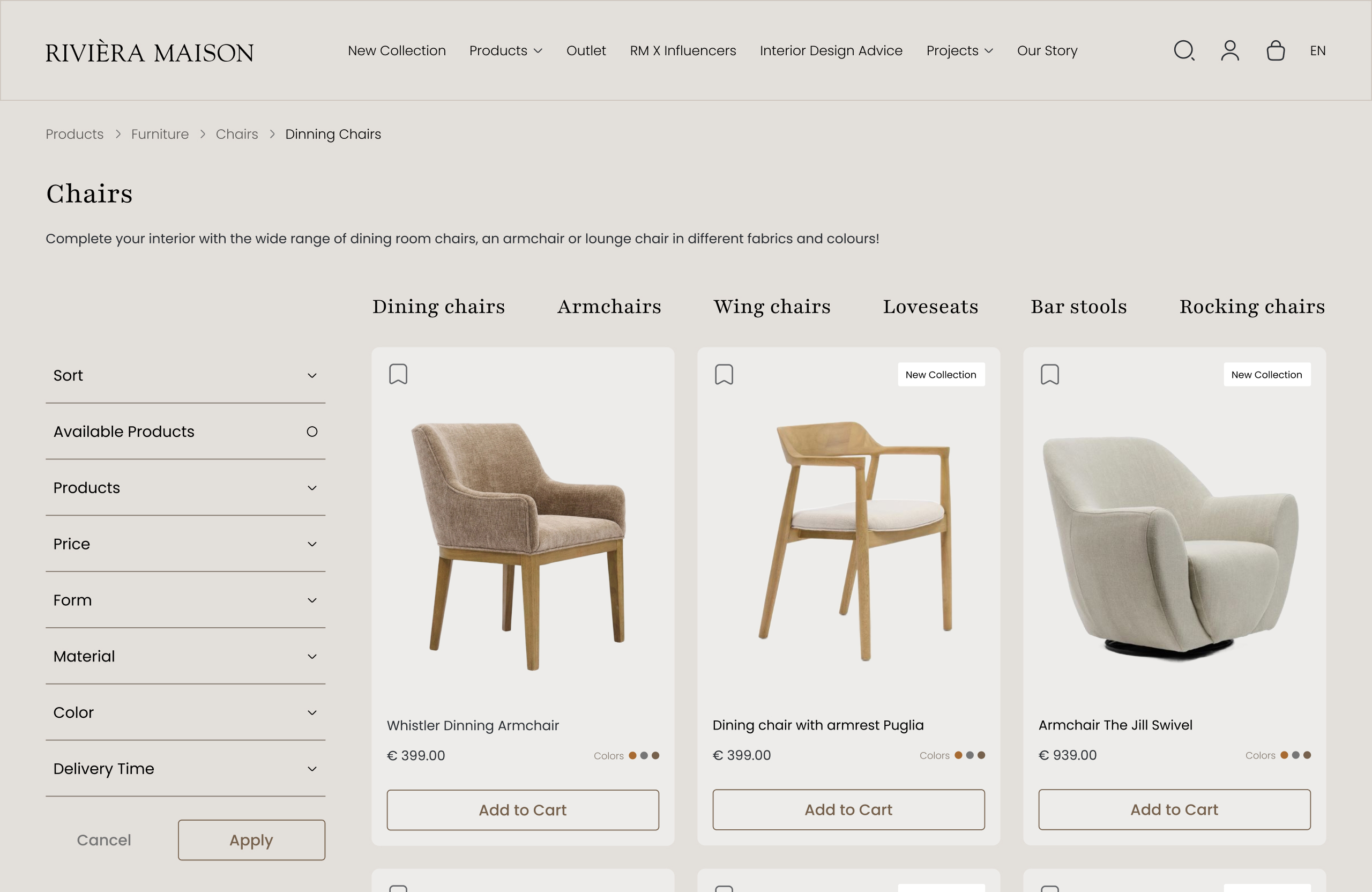
Product Listing Page (PLP):
A modular product grid with sticky filters and interactive previews makes browsing easier. Product cards are visually unified and communicate key details at a glance.
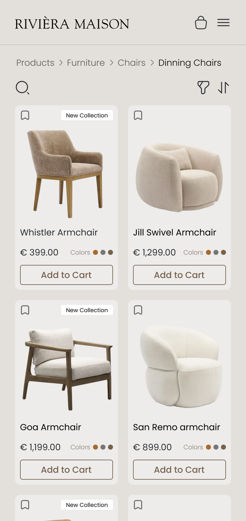
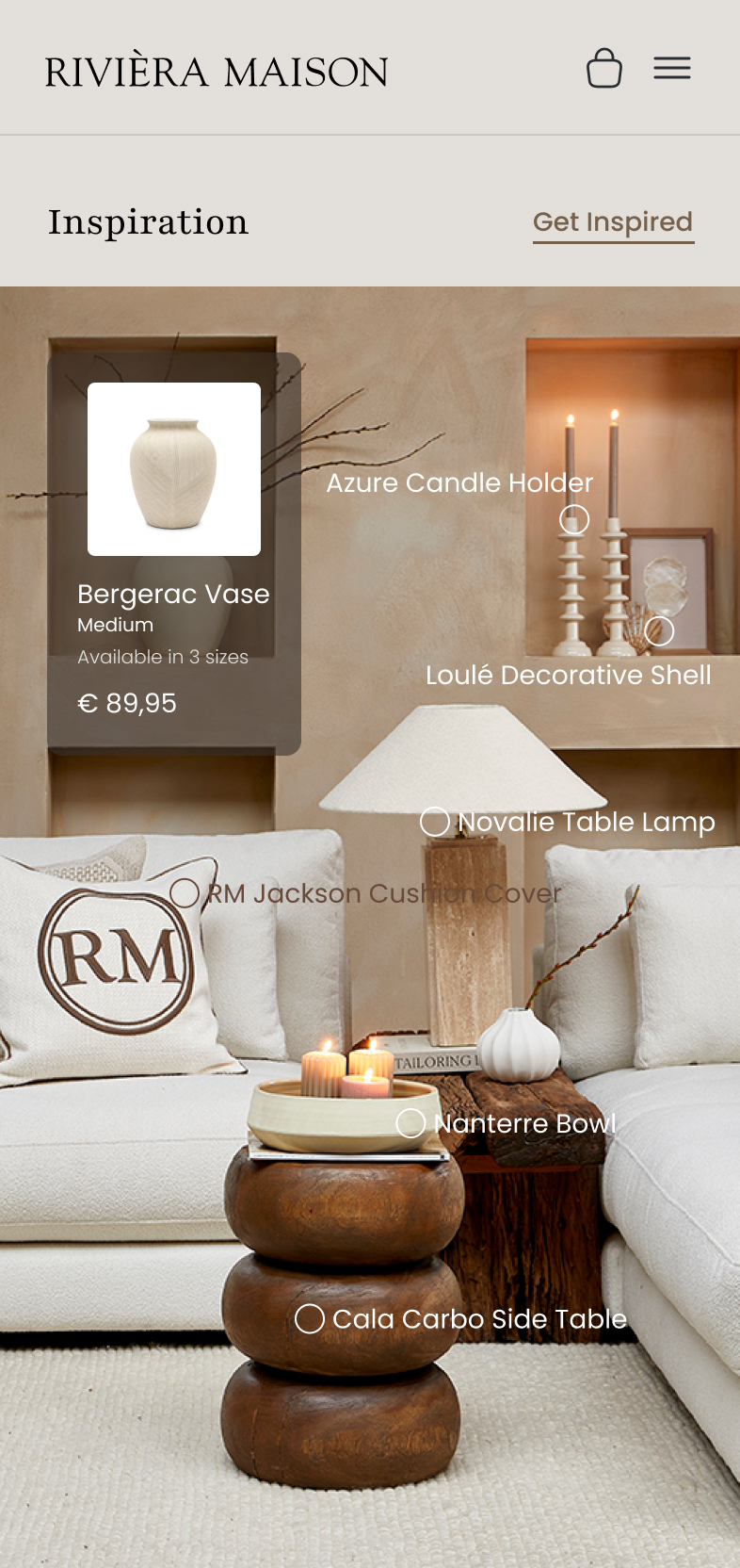
PLP Mobile:
A scroll-optimized product listing with swipeable filters, compact info hierarchy, and thumb-friendly tap zones, tailored for fast, on-the-go discovery.
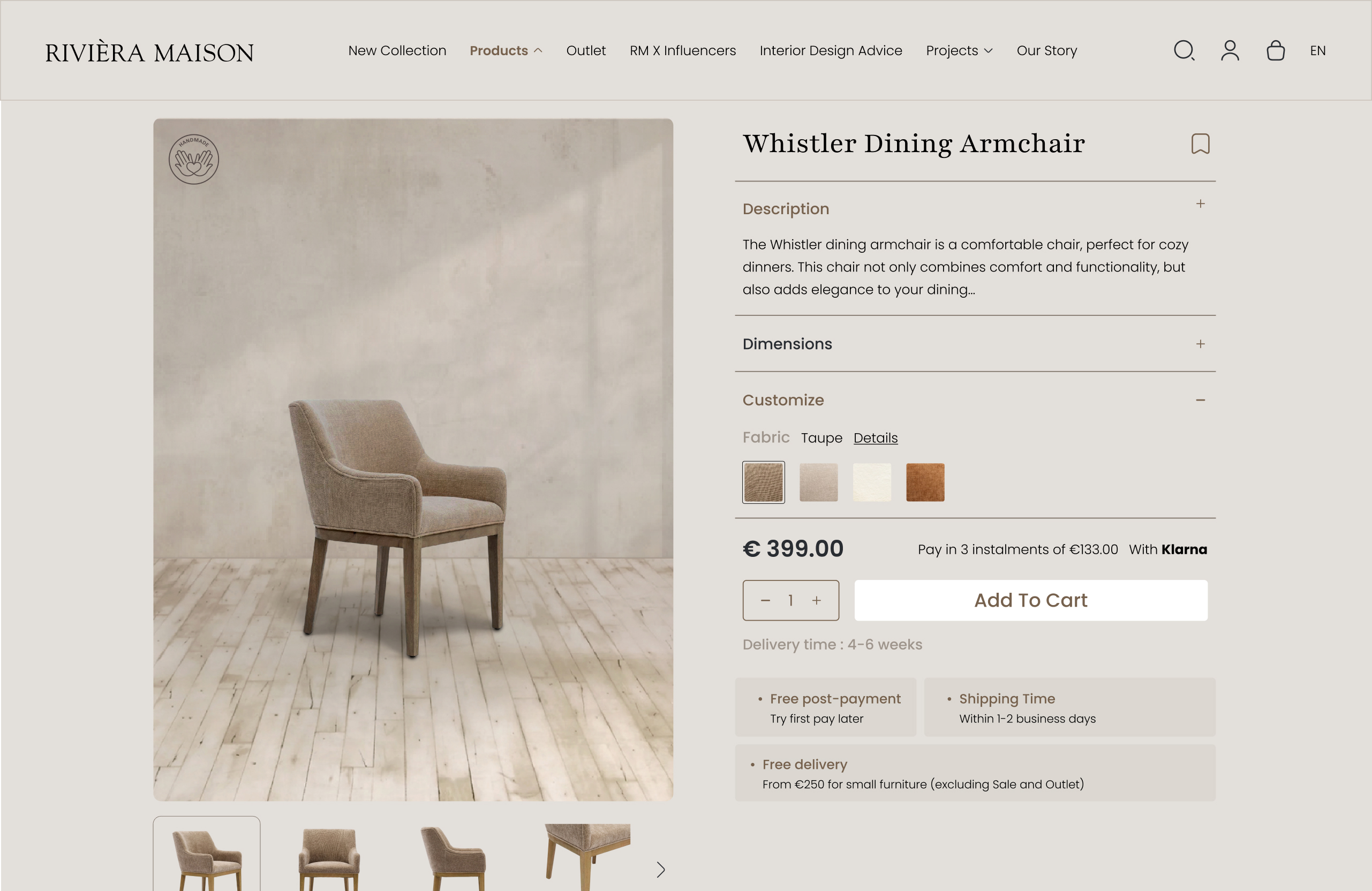

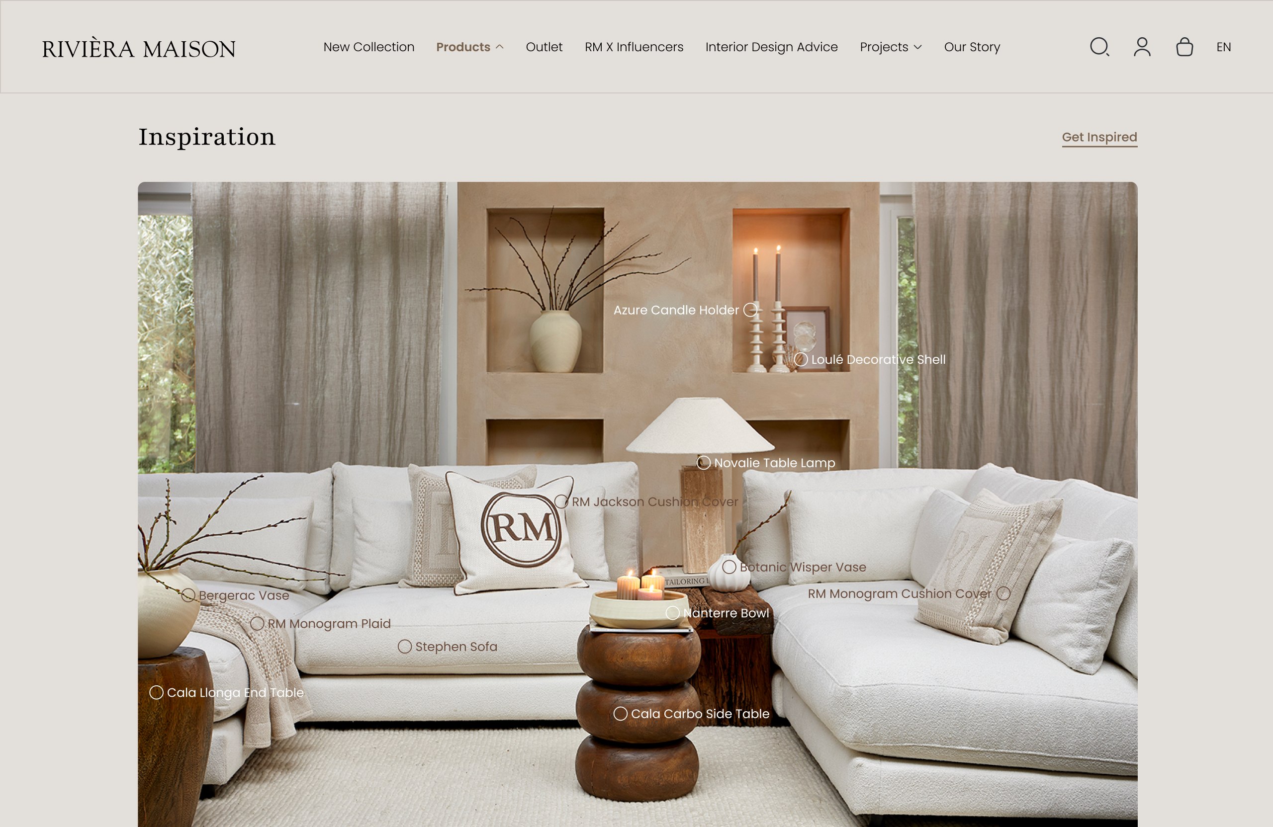
Product Detail Page (PDP):
The product detail layout emphasizes storytelling and functionality. Enlarged visuals, scroll-stable sections, and fabric/color swatches allow users to make informed decisions without visual overload.
PDP Mobile:
Key product info appears upfront, with collapsible details, swipeable galleries, and CTA buttons always in reach, making shopping smooth and intuitive on mobile.
Reflection
Working on the product modules taught me how much visual rhythm matters in ecommerce. Consistent card structures, clear pricing, and clean filtering create an experience that feels trustworthy and easy to shop. I would explore adding micro-interactions and stronger hierarchy for CTAs in a future round to increase scannability and engagement.
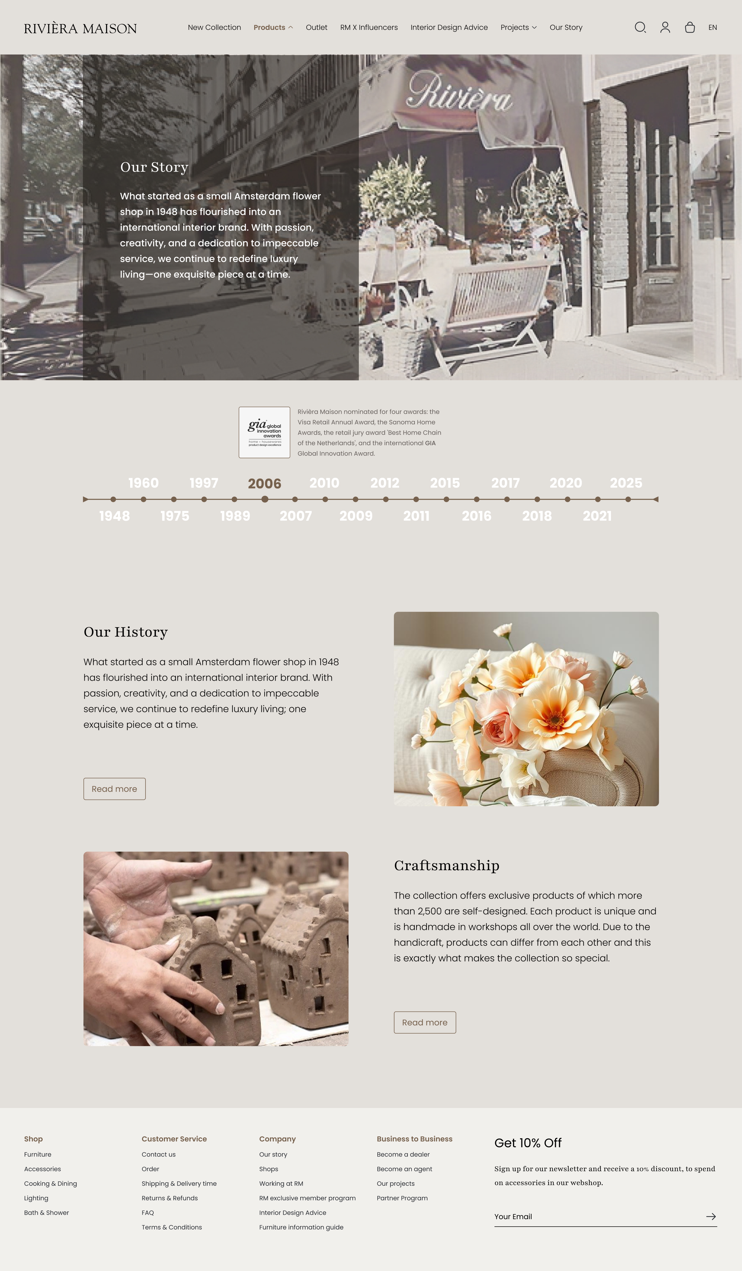
Brand Story (About Us)
An interactive timeline brings the brand’s rich history to life. From its Amsterdam flower shop roots to global expansion, the layout pairs editorial typography with immersive visuals, highlighting Riviera Maison’s commitment to craftsmanship and authenticity.
Reflection
Translating a decades-long brand story into a clean, visual timeline was a rewarding design exercise. I focused on creating a layout that could carry emotional weight through typography and layout without relying on dense text. If I had more time, I’d experiment with scroll-based transitions to make the storytelling even more immersive.
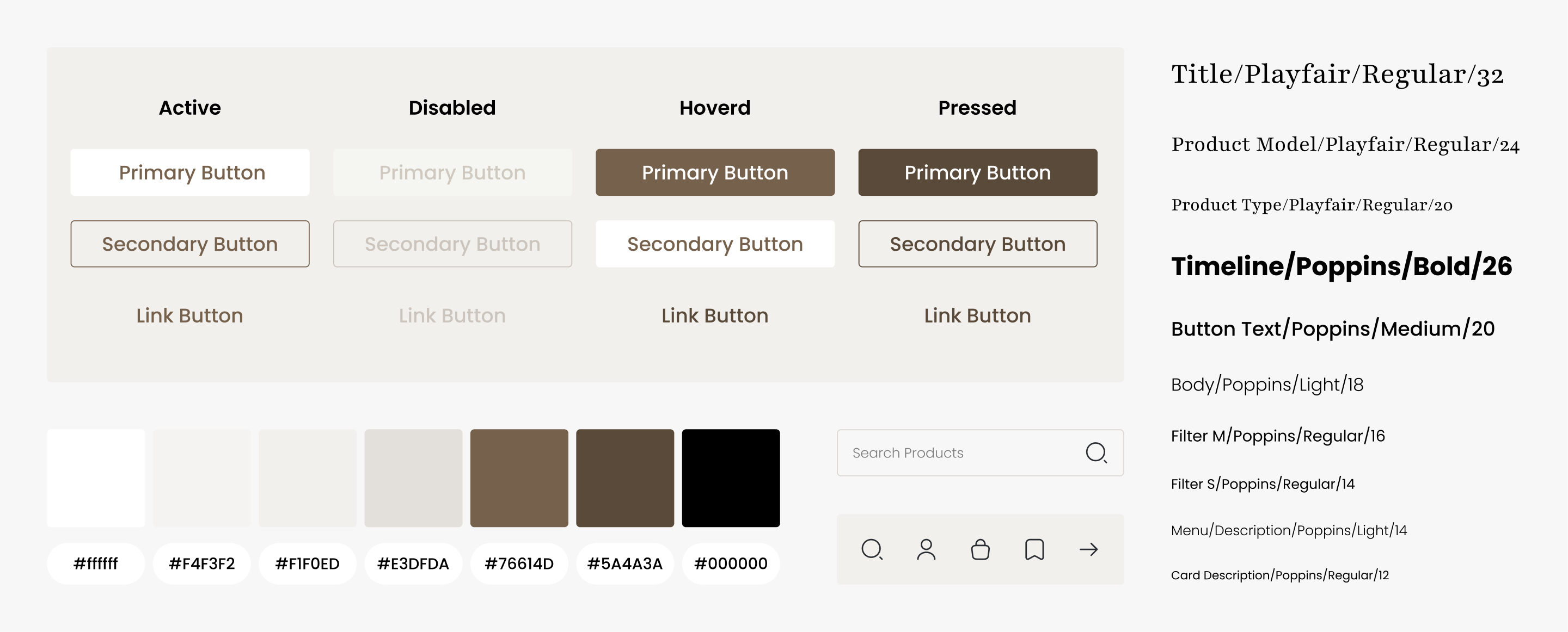
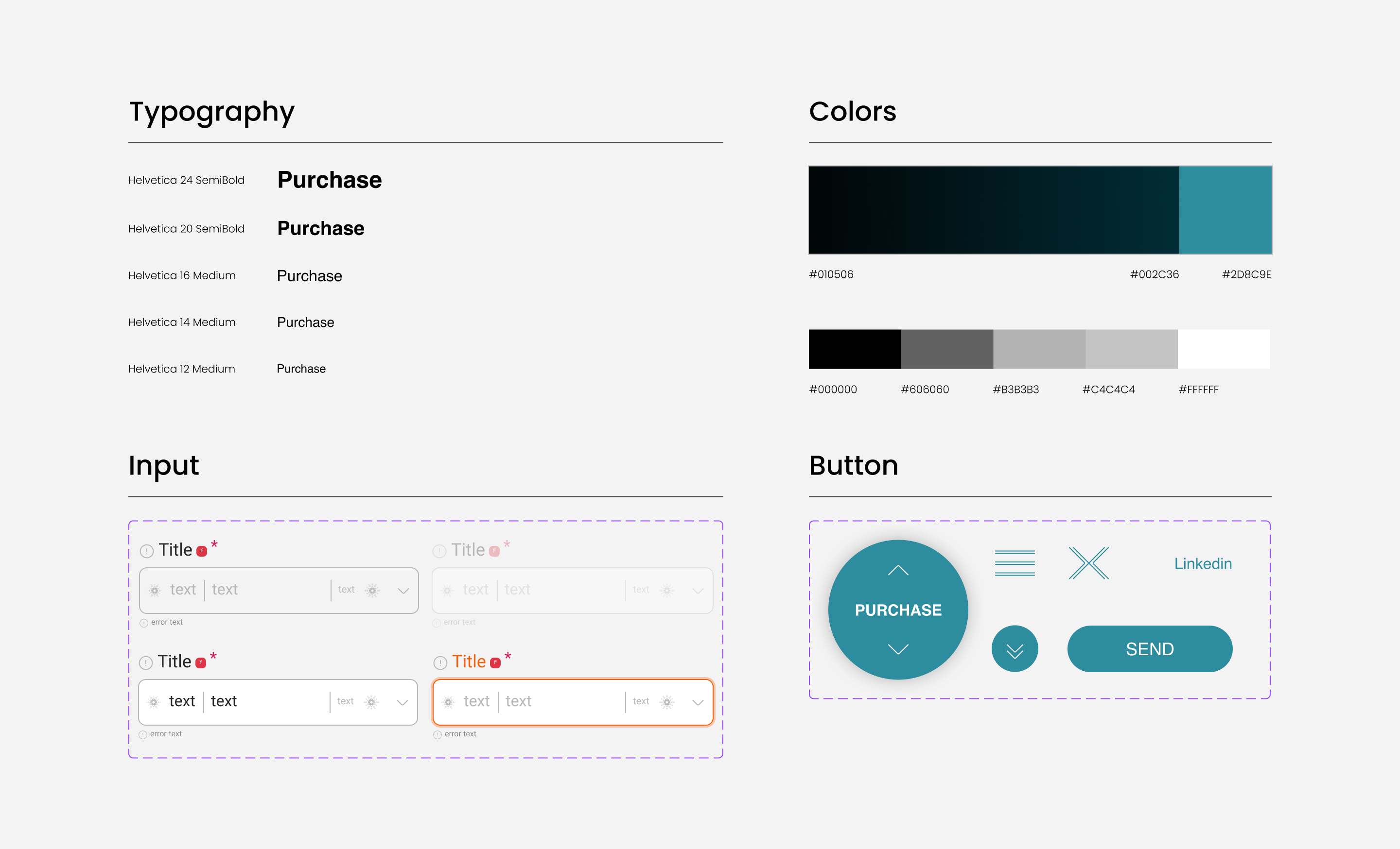
UI Style
A modular UI kit was developed to ensure consistency across components (buttons, cards, typography, and form elements), all designed with scalability and responsiveness in mind.
Final Thoughts
Without access to direct user research, I leaned fully into the visual language of the brand, making every UI decision reflect Riviera Maison’s warm, elevated identity. This project deepened my ability to design with intention, using layout, contrast, and typography as tools to convey mood, trust, and clarity.


